Monday, 31 December 2012

'My, your colours are all arms and legs, there's just no proportion!'

 Colour proportion is something new to me from my colour theory classes. I never before thought about how the quantities of particular colours could affect its perception. Complementary colours require a harmonious amount of each to work well together. It is general that yellow to violet works 3:1, orange and blue works 2:1 and red and green work 1:1.


 Harmony between these colours is visually pleasing but unproportionate colours will be noticeably unattractive. The use of colour proportion along will be useful for me in my own work. It is another tool for an artist to engineer the audience to how they want. In the examples below, a good understanding of colour proportion is demonstrated.


Wednesday, 26 December 2012

'I Broke My Colour'

 I recently experimented with broken colours in a colour theory lecture. Mixing two complementary colours together can be very boring, however can be useful for creating compositions with balanced saturation.

 When later looking into broken colours I came across alot of impressionist paintings which use a technique of breaking colours. This is not the same thing as a broken colour palette but more a technique used to create the illusion of colour mixing, 'optical mixing'. Instead of mixing a yellow and a red to create orange, impressionists would paint a dab of yellow and a separate dab of red next to the yellow. This 'optical mixing' also creates an orange, it is likely to be intense that mixing the colours normally. Claude Monet was one artist who contributed to this technique. 


 The painting above by Monet demonstrates this technique. If we were to go even closer to the image it would be more apparent but even still you can see the separate brush strokes used to create the mixing of colour. Below demonstrates how this technique works up close.


Sunday, 16 December 2012

Colour-scripting

 Seeing as in a few weeks time I will be creating my own colour script for my animated film, I thought it relevant to do a post on colour-scripting. 

 Ralph Eggleston came up with the idea to produce a colour-script for a feature film to map out the way colour and light would work within a film. Before he did this, no animation studio has consistently colour scripted an entire feature film. It first occurred to Eggleston to create a colour-script when he was given a deadline of three days to produce a couple of hundred background colour paintings. To be time efficient, Eggleston created quick pastel drawings on horizontal bits of paper to convey the colours for multiple scenes. There are a number of techniques for making a colour-script, in different media, styles and formats. Dice Tsutsumi was hired for colour scripting Toy Story 3", he notes the importance of the purpose of the colour-script. "colour-scripting is not about how well you can paint. Your job is not to make beautiful pictures. Its about how you can support the story with these images and lighting concepts." Tsutsumi explains. 


The colour script for Hansel and Gretel


The colour script for Brave


The colour script for Up

 From looking at the colour scripts you can instantly grab an idea of what a certain scene is trying to capture.

Thursday, 13 December 2012

Colour Grading

 I'm trying to look at the variety of colour shift with in a single film. Below I found three screenshots of inception which differ slightly and greatly.

Inception_Joseph Gordon Levitt waistcoat_(C) 2010 Warner Bros

The screen shot above has been graded with warm colours and is fairly saturated when we compare it to the shot below. While using similar hues of the same colour, it is more desaturated and captures a completely different feel to the above. Contextually we can tell the first is indoors and the below is out doors, so appreciate the change in colour as appropriate.


 In comparison to the last shot below, both of the above portray contrasting moods. The last shot evokes a very cold and mysterious mood. Of course the colour works along side the actors, the music, the mise en scene of a film to bring a shot together just the way it should be and it come as no surprise that there are such drastic changes in the films colour. 


 The colour temperature change is obvious in these comparisons and is used accordingly to affect the audiences perception of the scene.

Sunday, 9 December 2012

Narrative


 Animated films as I'm sure you know don't depict reality. They represent narratives and visuals that are works of art and imaginary. When telling a narrative colour is one of many tools that can be used used do this. The importance of it is vital in telling the story. I found this image below which is a colour concept of the film 'Shrek'. It shows how artists might experiment with different colour palettes with a concept to obtain a variety of looks. The first concept has been given a yellow-green colour theme which gives a much less menacing look compared to the red-purple theme. While subtle the differences between the first and second concepts create different moods.

 While conveying mood the concepts could also be used to display time of day, emotion or weather as well as many other things. The bottom concept can be interpreted in many different ways. It could be the end of the day with the sun setting in the sky, It could be representing heat, fire or some form of danger.

I have also included an image from the book 'Bold Visions: The Digital Painting Bible', which compares one image with two colour variations. As you can see the blue variation could help tell the narrative as in a very cold place and the red variation can tell the narrative as in a very hot place. Besides temperature the images can also be compared with levels of danger, the characters you might find in such places or even to evoke the audience in different ways.


Value


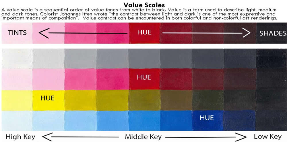
 As my blog is on colour theory a though a post about its basic terms would be a good start. Value refers to the lightness or darkness of a hue in relation to white or black. As an example, yellow is a “High Key” value or is closer to white. A dark hue such as violet or blue is a “Low Key” value and is closer to black. Scales of values can be described in a chart showing several distinct gradations. The term “Brightness” is also used when referring to a value scale. Contrast of value can be useful in defining objects in space from each other while gradation of a value can suggest the contour of a surface.


Wednesday, 5 December 2012

The Meaning of Colour

 I find it really interesting that colours can hold so much power psychologically that we don't even realise. If you just Google it you will be overloaded with different opinions, views, theory's etc. What I did find was a website completely devoted to the meanings of colours and thought it interesting to share a few on here. It is believed that colour has an impact on how we are perceived, so if we wear different colours we are making different statements and will be interpreted in different ways to people around us. The colour red is meant to present some who's ready to take action, passion and anger. The colour orange is the colour of social communication and optimism. Yellow represents the mind and intellect. Green is the colour of balance and growth. Blue is the colour of trust and peace, purple being imagination and indigo, intuition. 
 Of course we all associate some colours with connotations, some of which are widely accepted. The colour red to be associated with danger and love is an association most people would make. As I listed above, some people believe colours to have much wider meanings.

Saturday, 1 December 2012

Colour in Game


 I recently played modern warfare 3 and it occurred to me the strong range and use of lighting and colour to convey moods. Generically as seen to the let a lot of scenes are grey and not too interesting, often de-saturated a little to convey the gritty mood of war. 


 However there are moments where there are clear colour shifts. This one is a classic, a yellowish-red colour, not only in game but generic in films focused around war and combat. It mimics the colours of eastern countries and the hot climates. 


 Another clear colour shift to a blue-purple to represent the night time. In game it portrays stealth, espionage and variety. This sort of grading is another generic idea. We know when we see this kind of colour that it is night time although the night is hardly blue at all, but an example of how colour can represent something strongly and even provoke ideas in our heads.